Impulso —
Onboarding Redesign &
Logged Experience
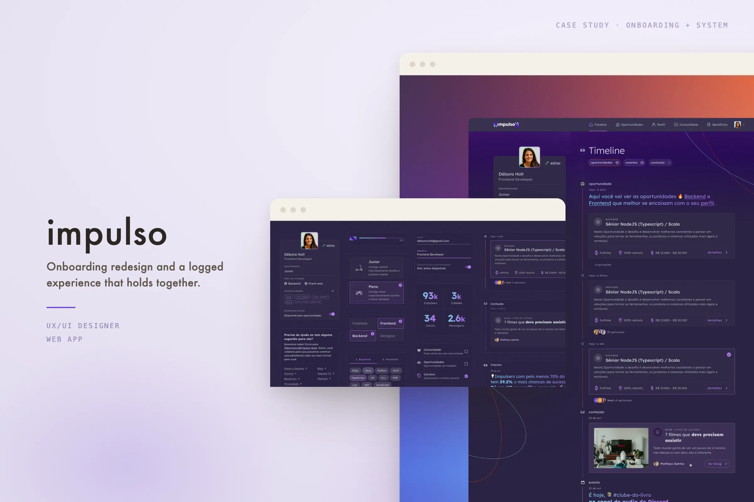
UX/UI redesign of the onboarding flow for a People Tech platform connecting companies and tech professionals, plus improvements across the logged-in product experience.
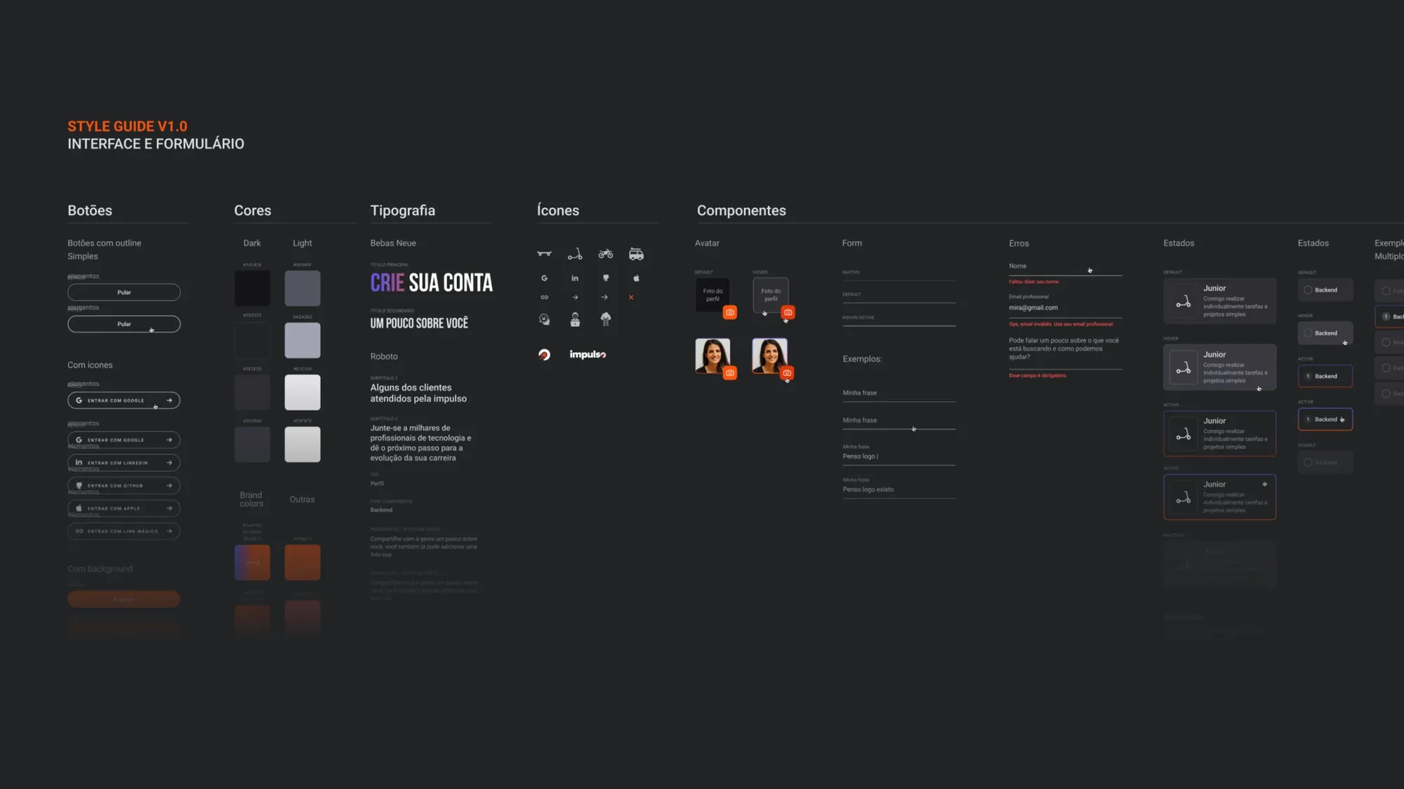
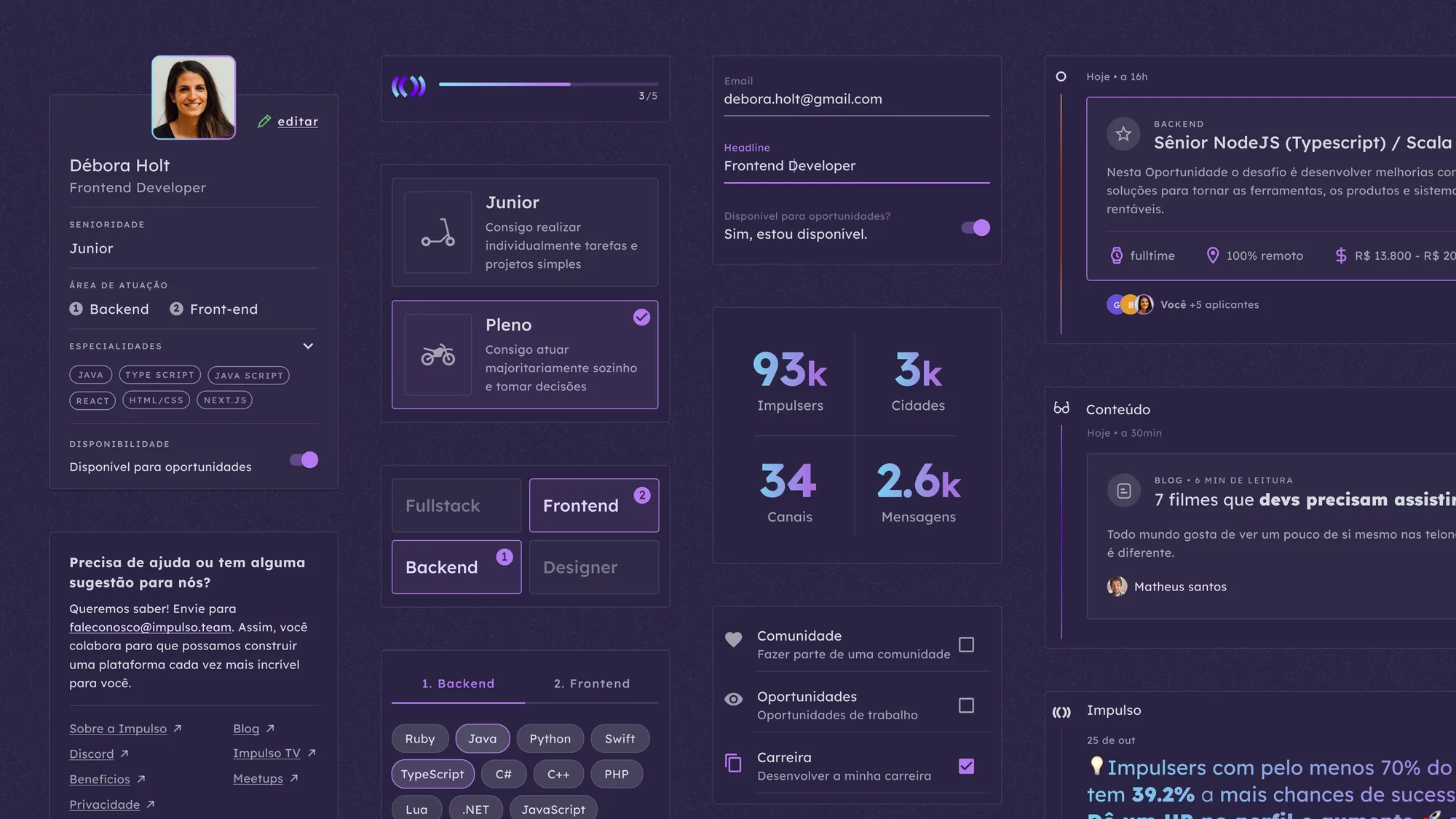
An onboarding redesign and logged-experience refresh for the same People Tech platform — plus the style guide (color, type, components, states) that holds both together.
Info
| Timeframe | 2022 → 2023 |
| Location | Brazil / Remote |
| Team size | 5 — 10 |
| Platforms | Web app |
| Industry | HR & Recruitment / IT Services and Consulting |
| Company | Flama.is |
| Website | impulso.team |
The challenge
The original onboarding flow lacked clear progression and structure. New users were introduced to multiple concepts at once, without a strong sense of direction or visible progress. This created friction during a moment that should build clarity and trust.
The challenge was to design an onboarding experience that felt guided, intentional, and aligned with real user goals — while staying consistent with the broader platform.
My role
As UX/UI Designer, I led the onboarding redesign from concept to delivery. This included restructuring the user journey, defining interaction flows, creating wireframes, designing high-fidelity UI, and refining prototypes.
I worked closely with engineers and product stakeholders to align the flow with business priorities and technical constraints. During implementation, I supported interface refinement so the final experience matched the intended visual and interaction quality.
Approach
Onboarding redesign
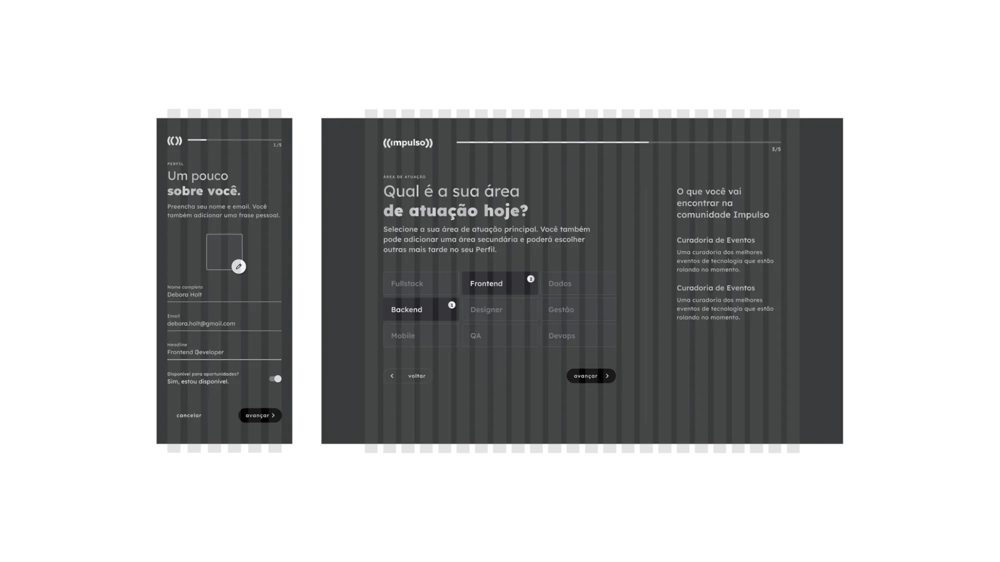
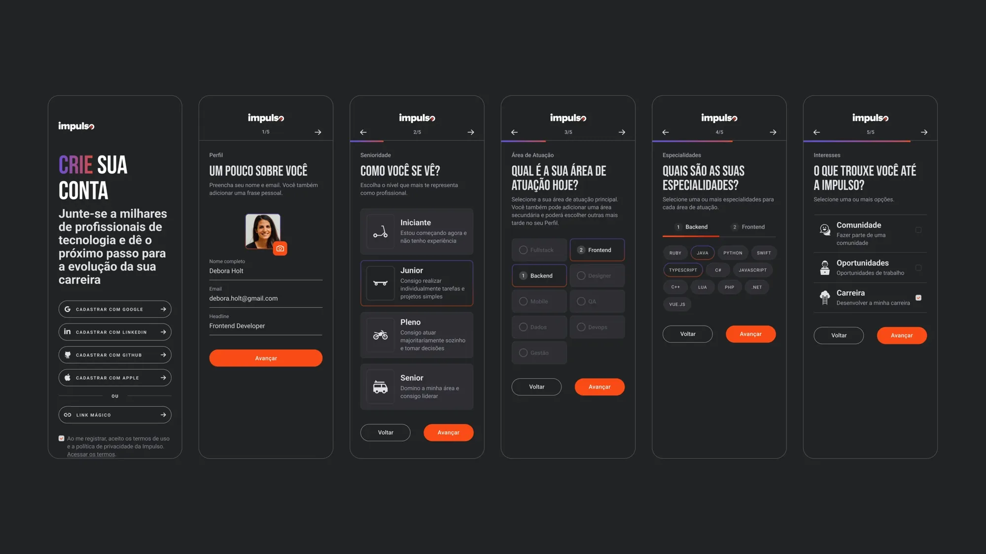
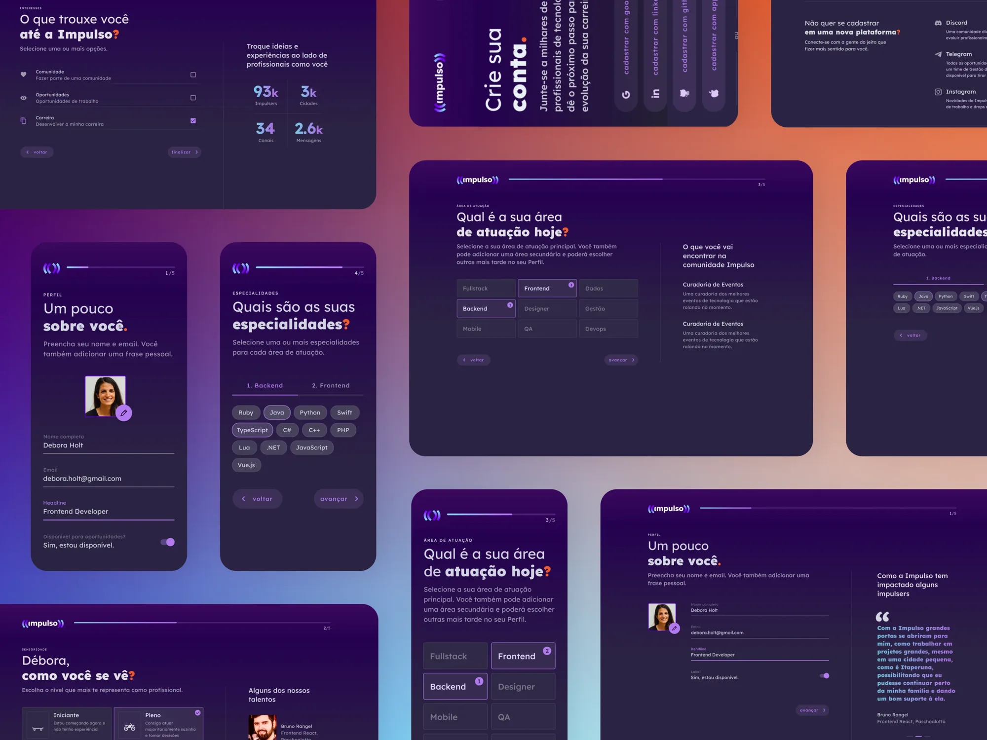
The new onboarding experience was structured around clarity and momentum.
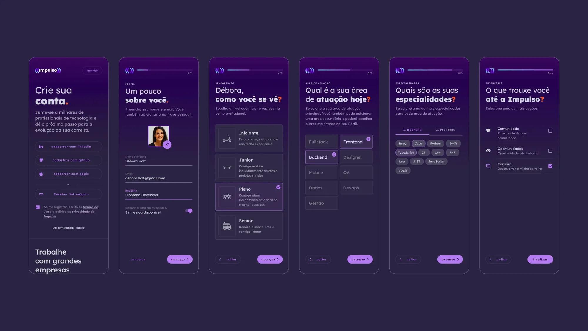
The old flow asked for everything at once, with no visible progress. The redesign spreads it across six steps — one decision per screen, progress always in view — so a new user knows where they are and what's left.
The redesign focused not only on usability, but also on tone — making the first interaction feel supportive, structured, and purposeful.
Logged area improvements
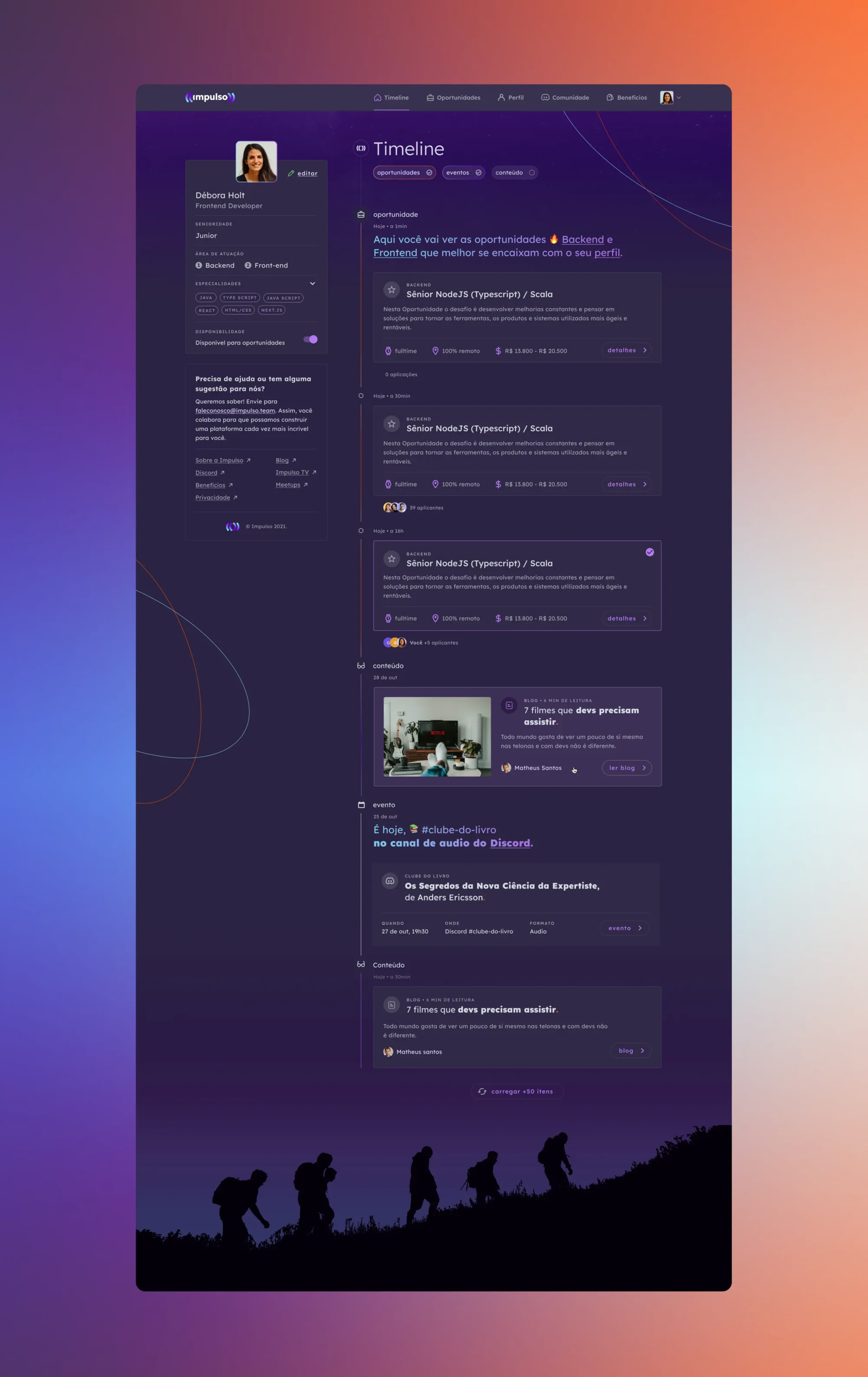
In parallel, I contributed to improvements in the authenticated experience to ensure consistency after onboarding.
This included refining layout structure, improving navigation clarity, and enhancing visual hierarchy across key screens. These updates supported a smoother transition from onboarding into everyday product use.
Collaboration on UI foundations
To maintain visual cohesion across the platform, I collaborated on refining UI standards and visual guidelines, so onboarding and logged-area improvements aligned with a consistent interface language.