Nexur —
Payment
Experience
Designed a clear and trustworthy payment experience for fitness professionals and their clients on a subscription-based training platform.
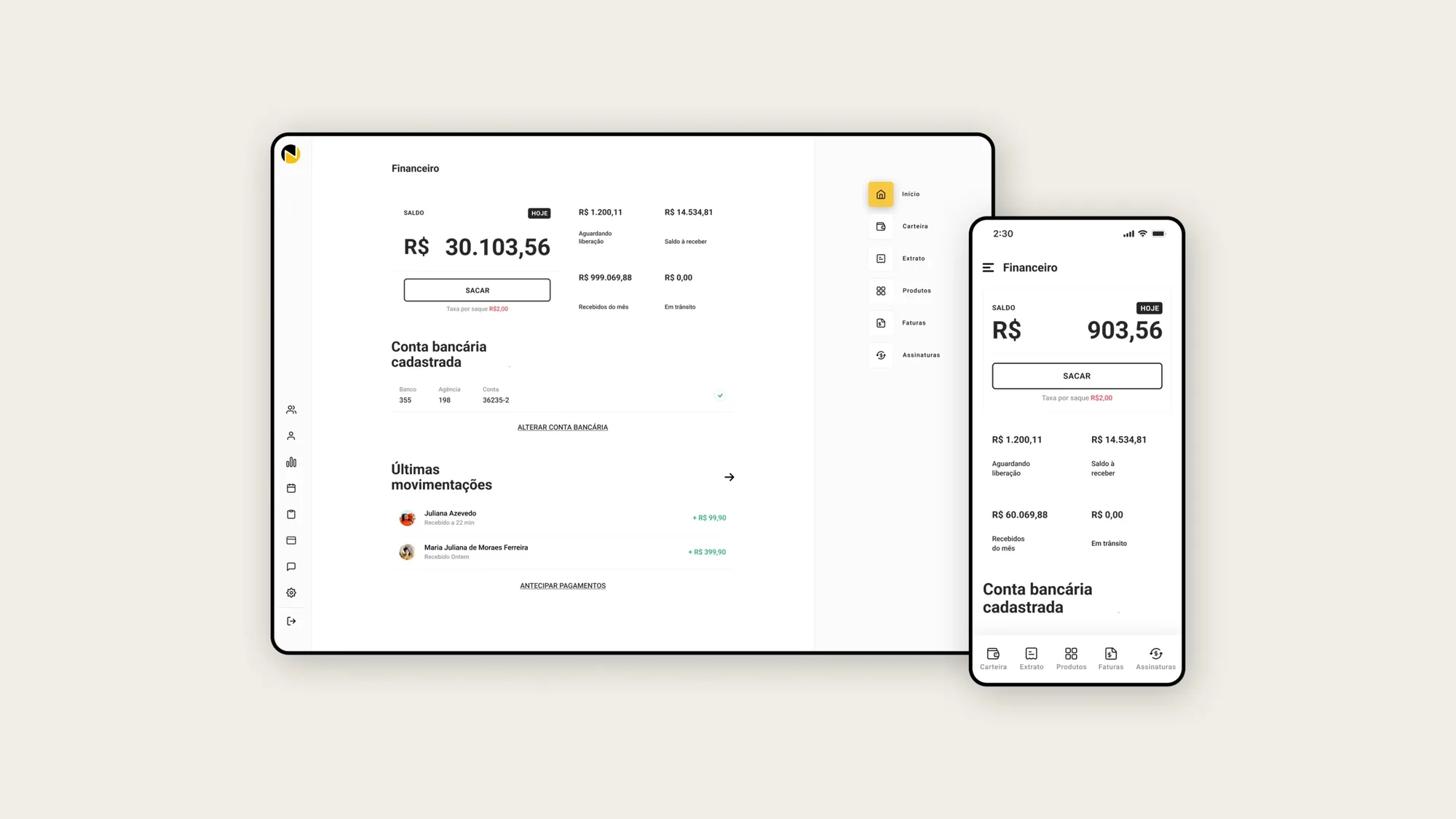
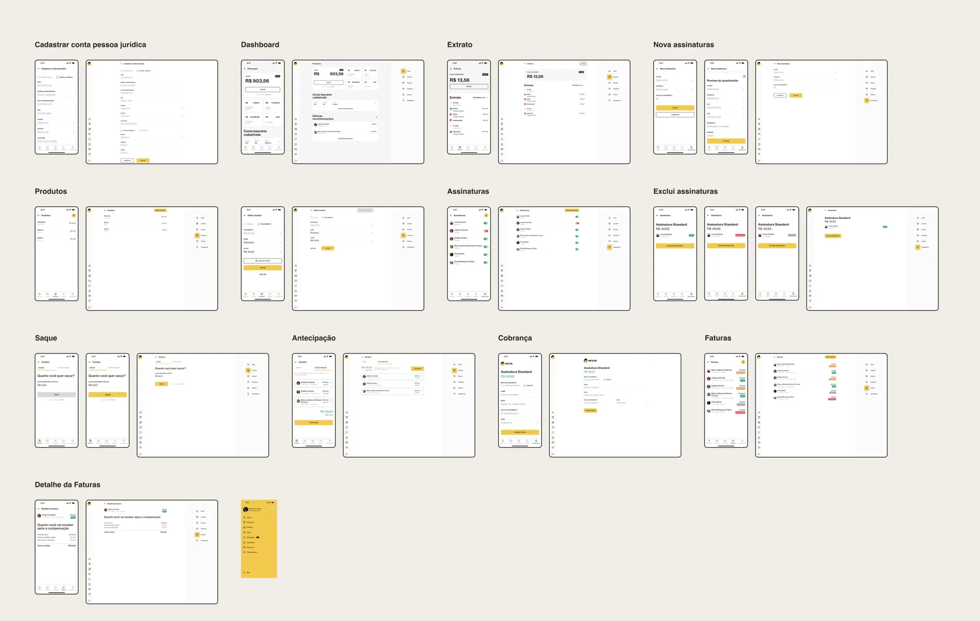
A payment experience for fitness pros getting paid. I consolidated 4 money domains — payments, subscriptions, wallet, invoices — into one trustworthy system across 30+ screens on mobile + web. Shipped: Nexur Trainer is live on the App Store and Google Play.
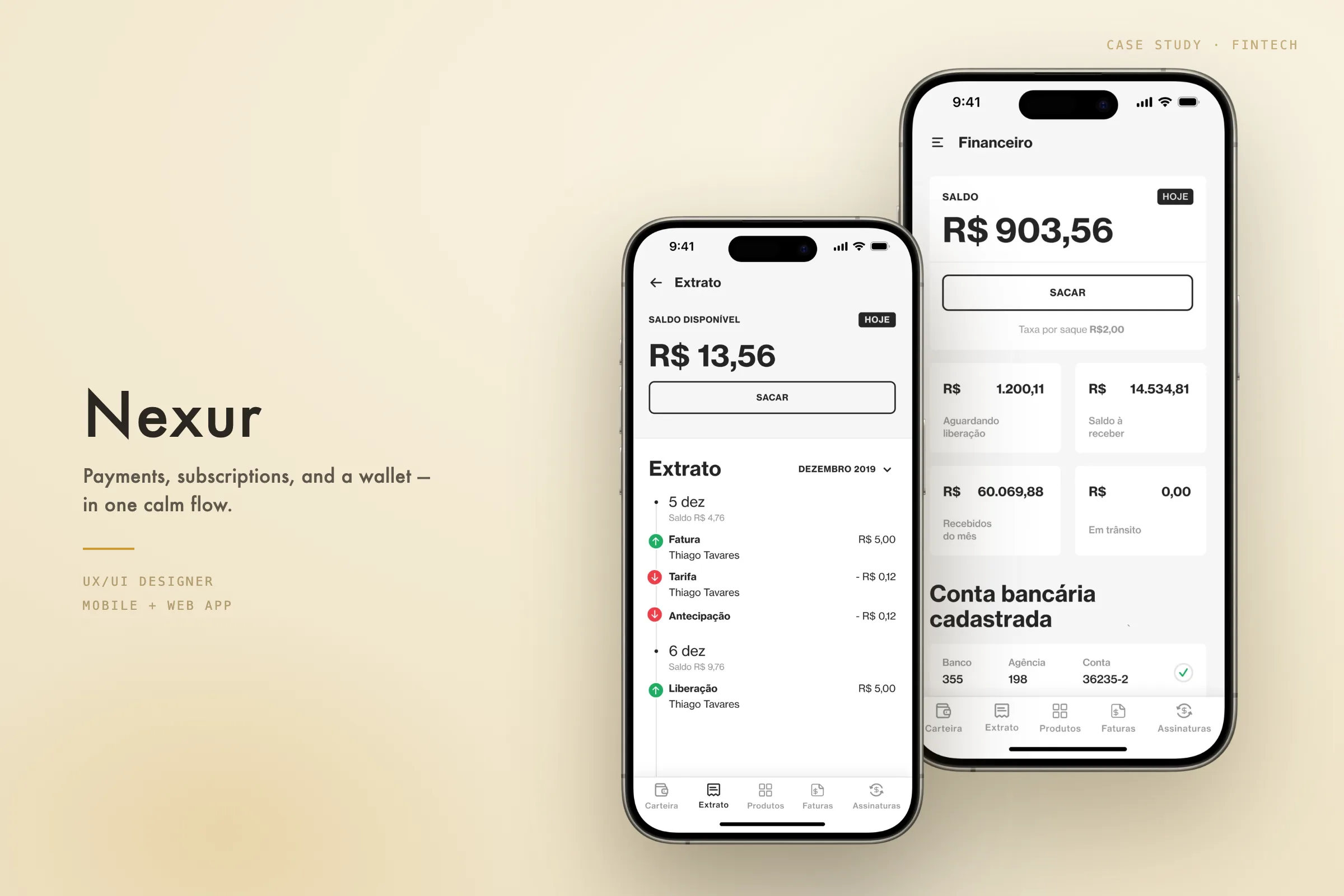
Nexur is a fitness technology platform used by trainers and clients to manage training programs and subscriptions.
I worked as a Product Designer on the Payment feature, focusing on trust, transparency, and predictability — designing flows that help trainers manage their business and help clients understand exactly what they are paying for.
Info
| Client | Nexur |
| Industry | Fitness & Wellness Technology |
| Feature | Payments |
| Year | 2022 |
| Role | Product Designer |
| Platforms | Web & Mobile |
| Tools | Figma · Miro |
The challenge
Payments are a critical moment in the product experience — trainers needed clarity and control over subscriptions, clients needed transparency around pricing and payment status. The challenge was to design a payment experience that feels simple, transparent, and trustworthy for both sides.
What I did
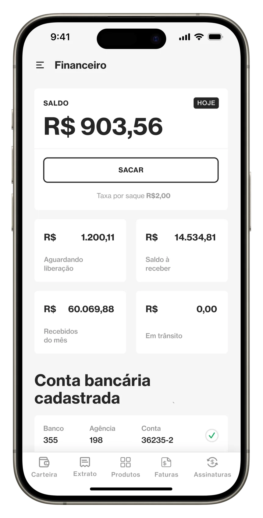
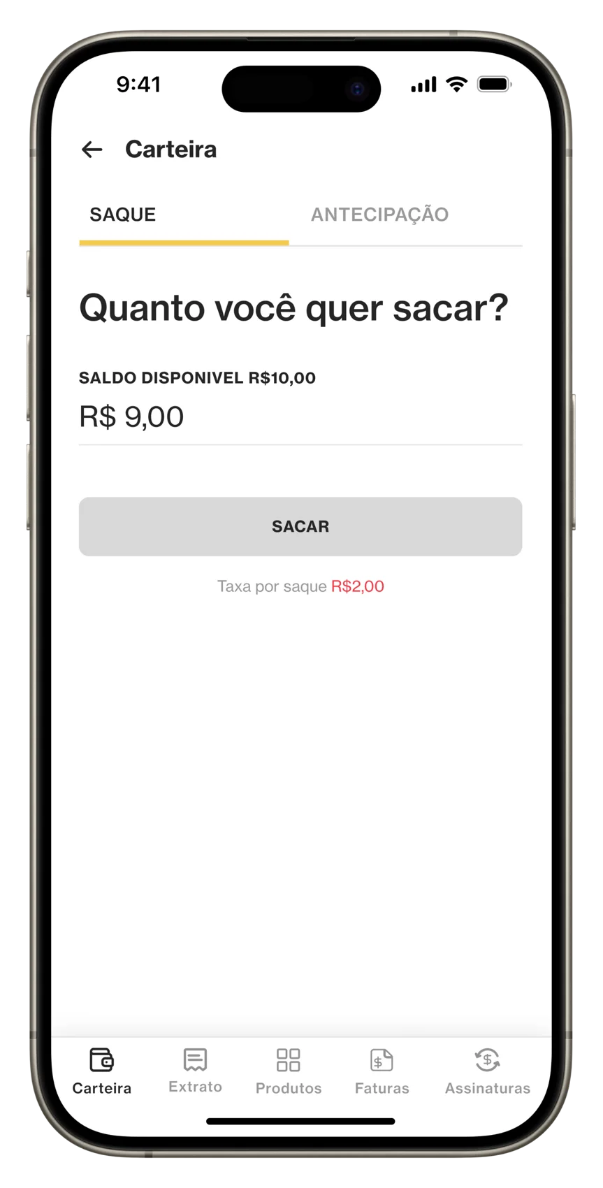
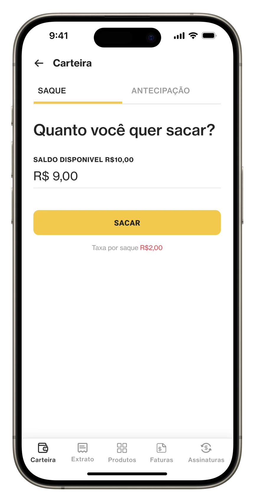
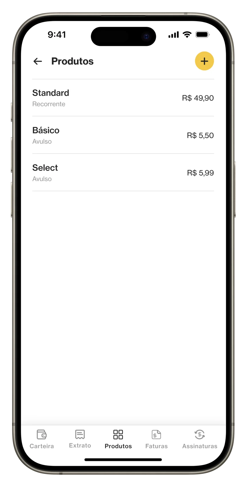
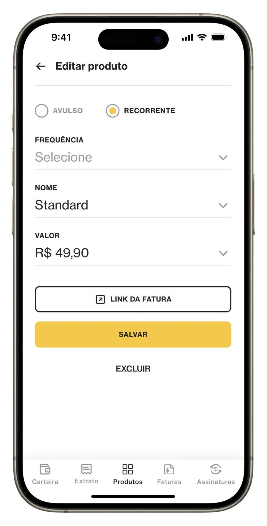
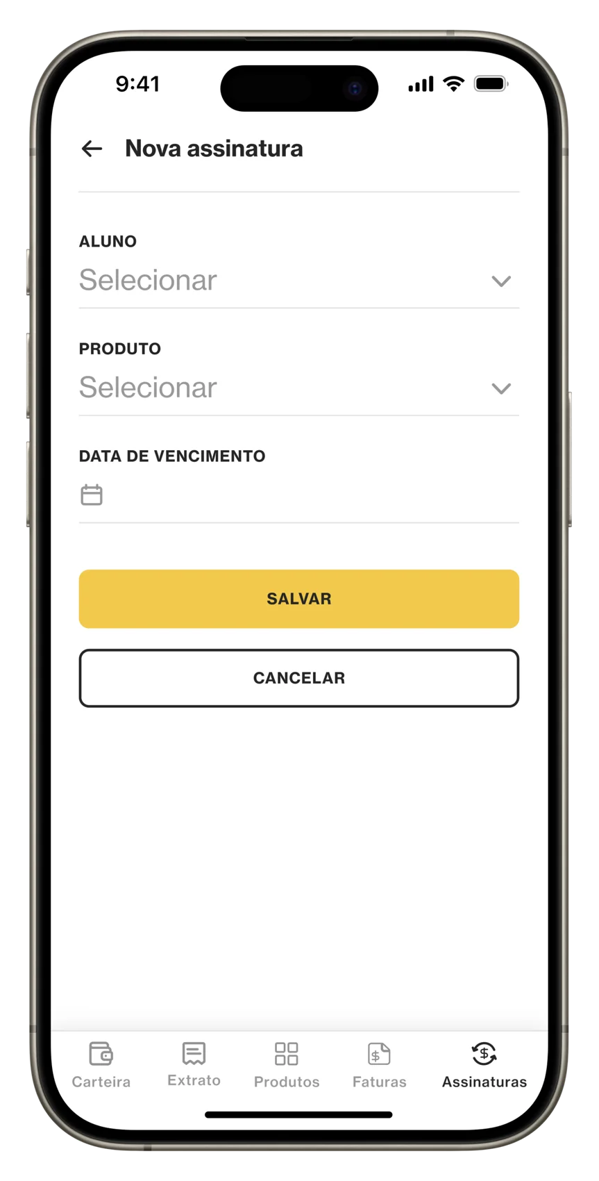
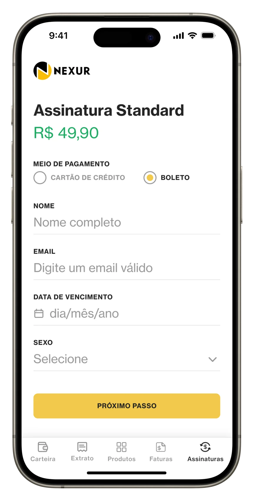
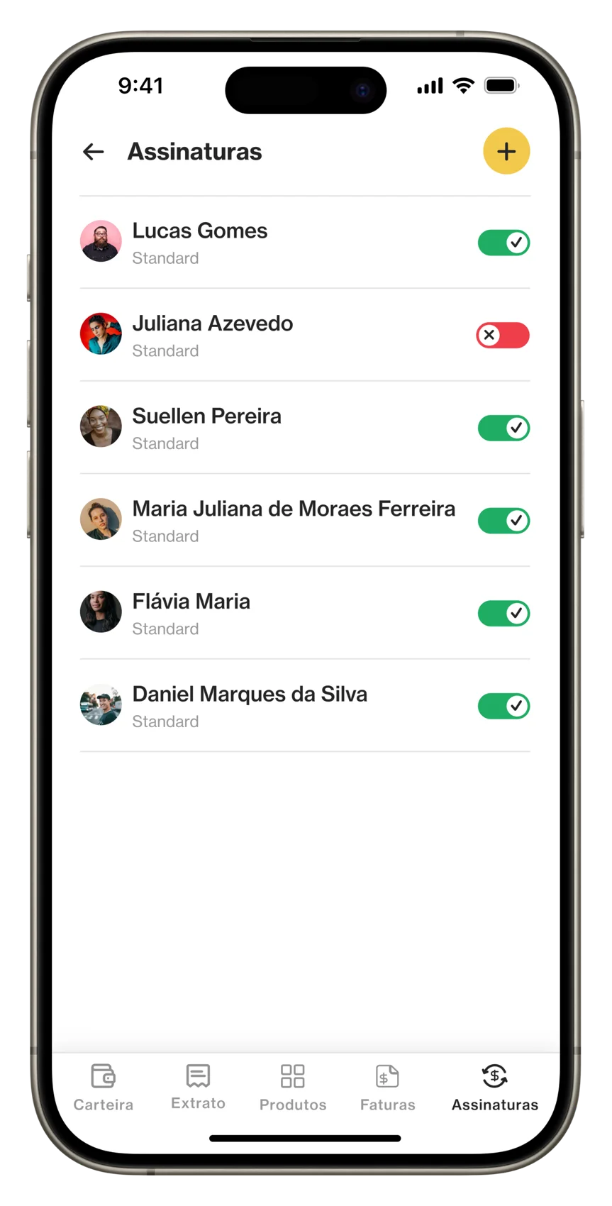
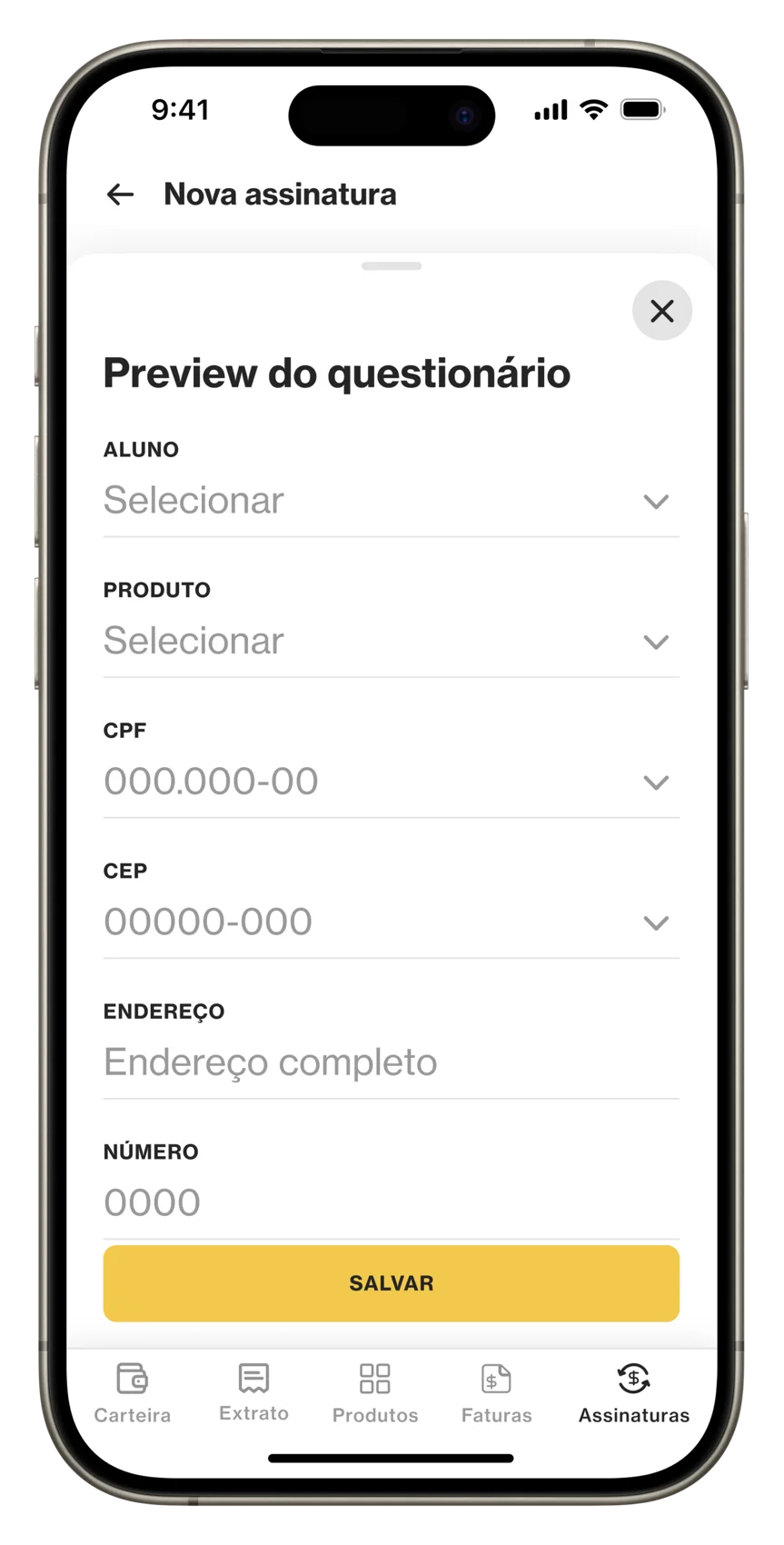
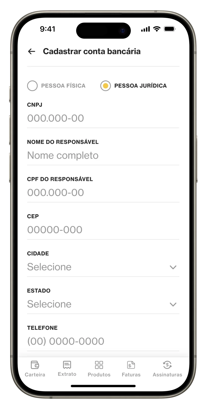
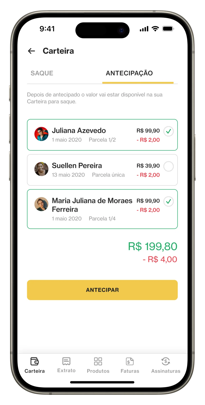
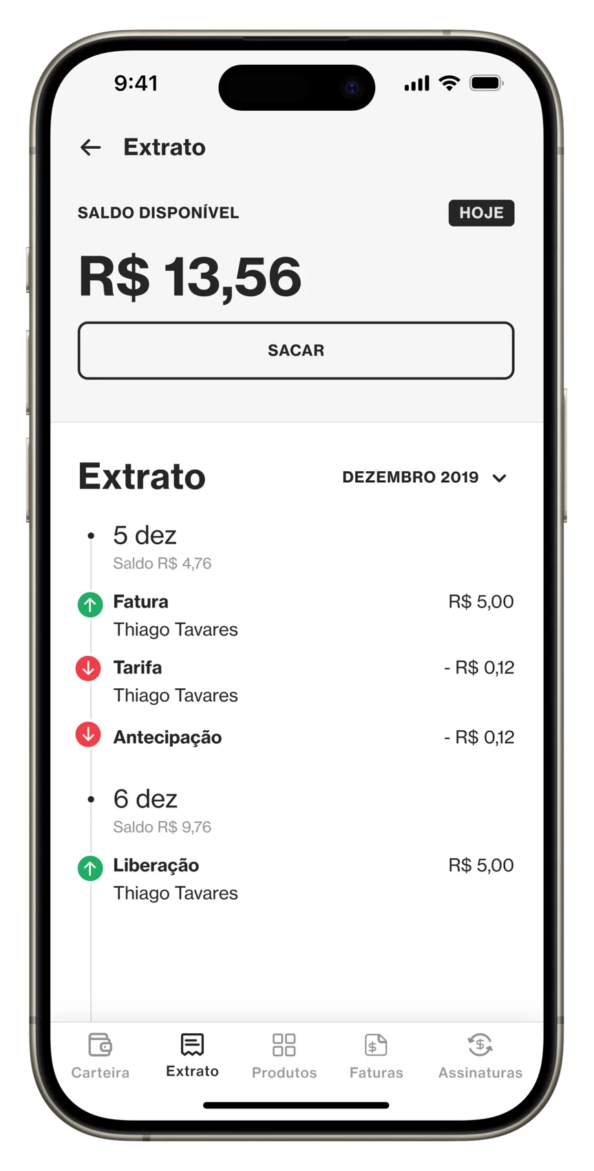
I owned the end-to-end design of the Payment feature — credit-card and Boleto checkout, recurring subscriptions, shareable payment links, and the wallet and withdrawal flows — with every state defined, so the app never leaves a trainer guessing whether money moved.

Approach
Designing for confidence and predictability.
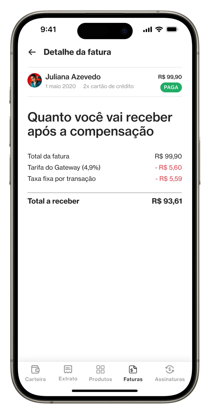
I mapped the full payment journey for both trainers and clients, identifying moments where clarity and reassurance were essential. These insights informed how pricing, billing cycles, and payment states were communicated across the experience.
Design process
Balancing business needs with user clarity.
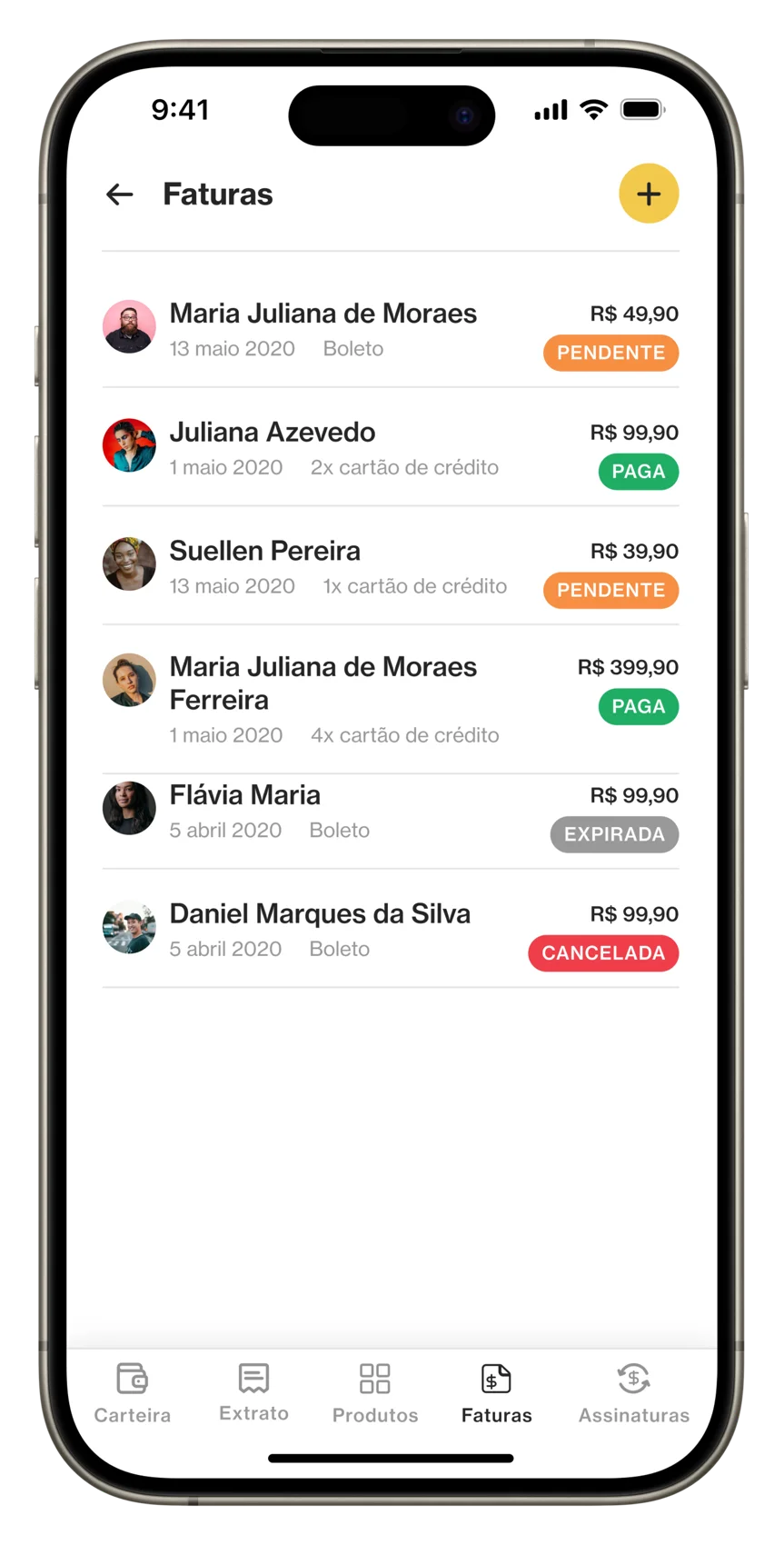
The payment flow was structured to clearly present plan details, billing information, and payment status. Strong visual hierarchy, clear labeling, and feedback states ensured users always understood what was happening — especially during confirmation, pending, or error scenarios.
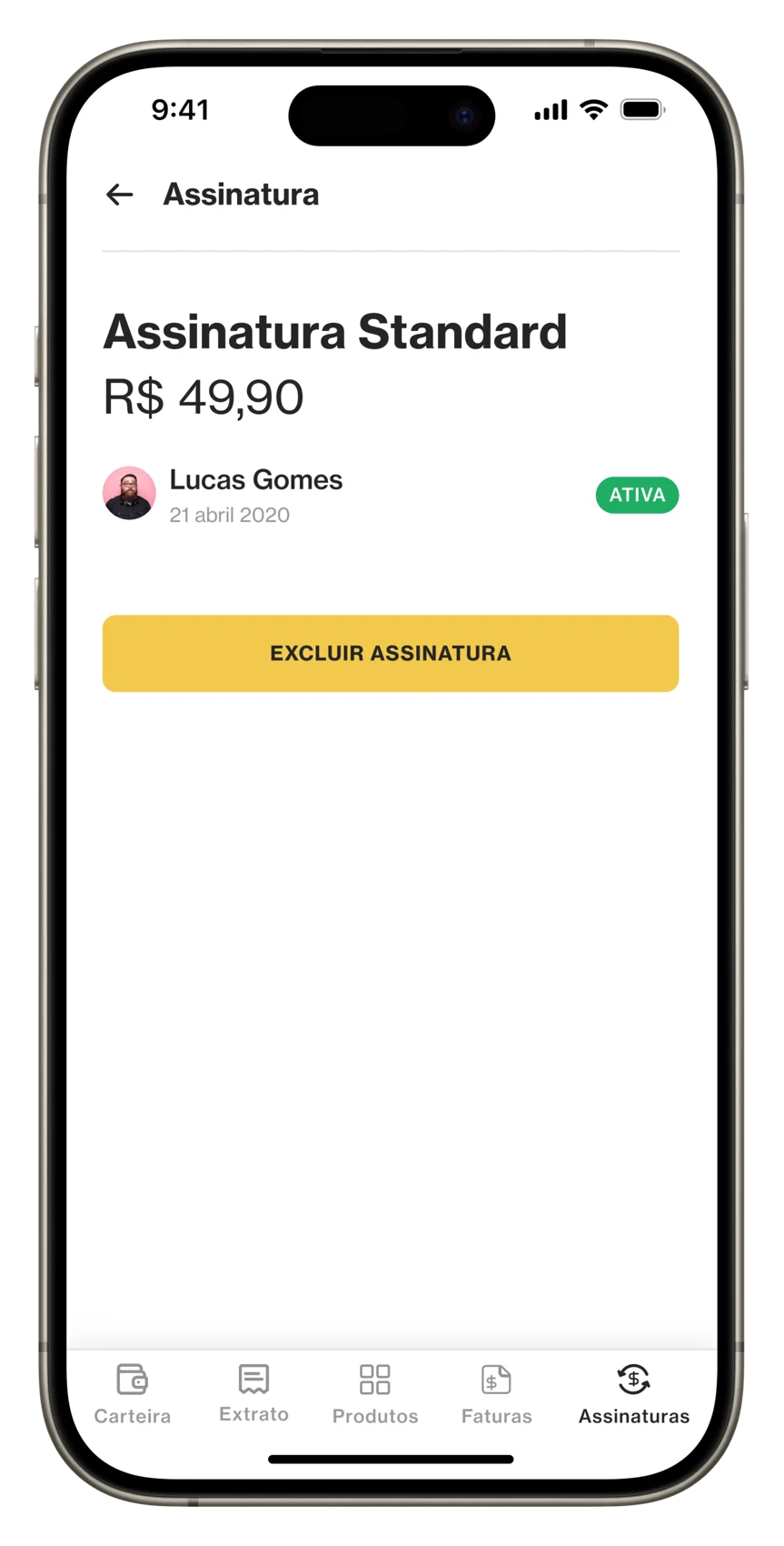
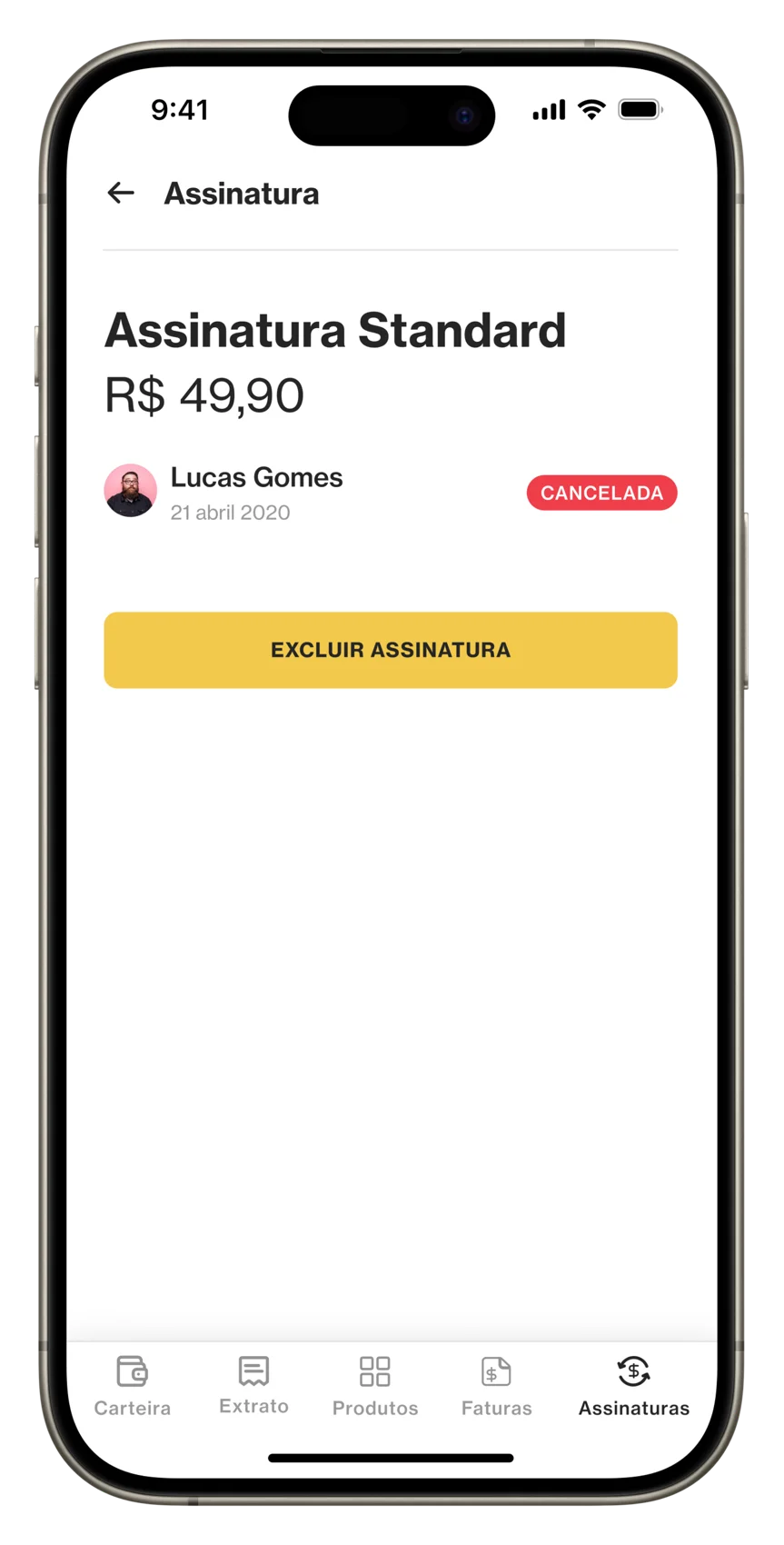
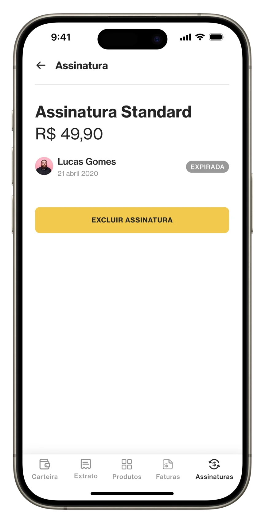
Consistency across web and mobile was a key focus, so the experience stayed familiar and reliable on any device.
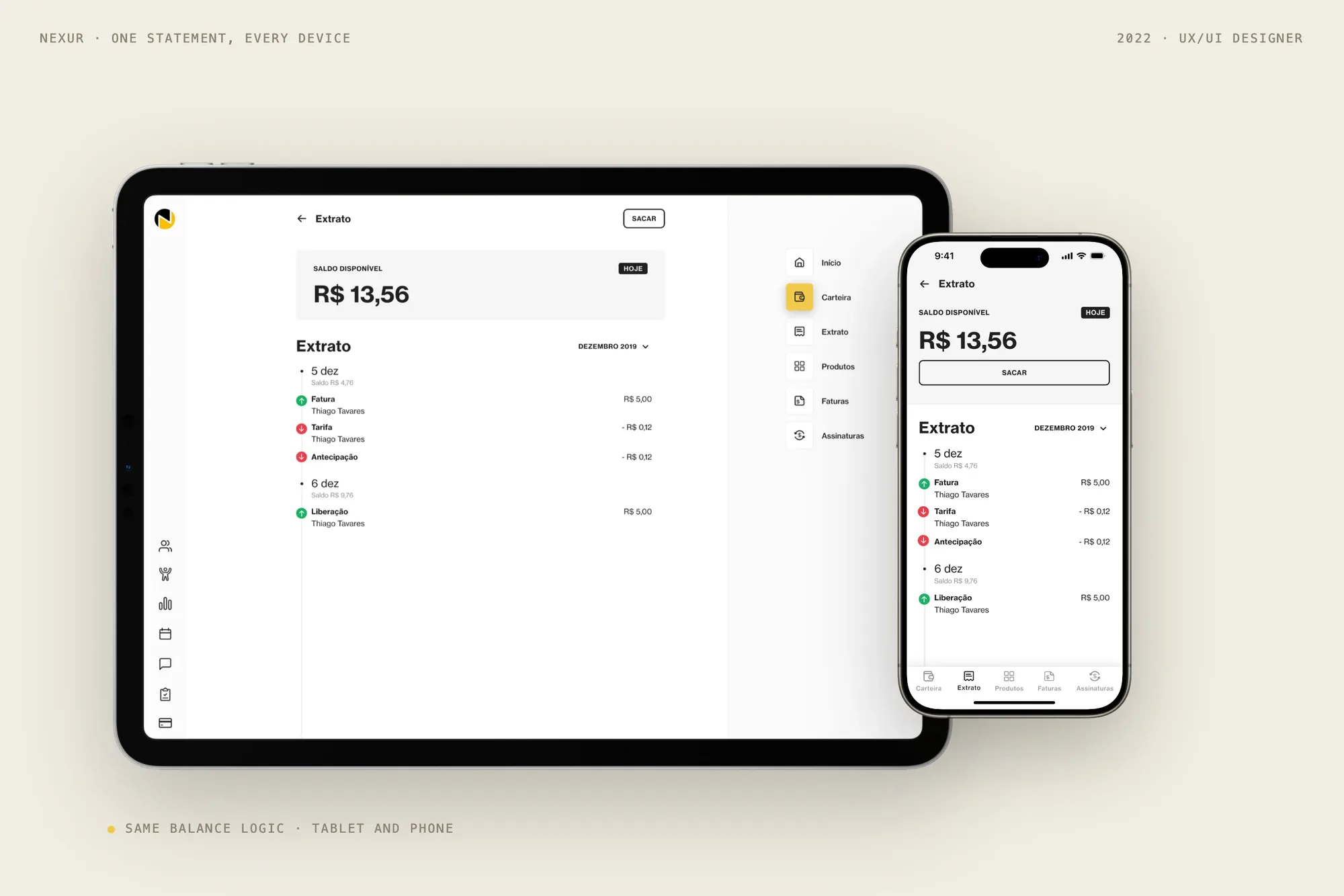
The solution
The redesigned payment flow clearly communicates pricing, billing cycles, and payment status, with immediate feedback — designed to reduce hesitation during revenue-critical decision moments.
Key learning
Designing revenue-critical features reinforced the importance of clarity, predictability, and feedback in building user trust.