Parléa —
the French you
have to say out loud
A pronunciation and speaking trainer for Portuguese-speakers preparing for the TCF Canada exam. You read a phrase, record yourself, and get a score sound by sound, in the version of French the Québec exam actually uses.
A French speaking trainer for Portuguese-speakers prepping for the TCF Canada exam. I designed and built it solo — brand, design system, AI speaking surfaces, and the front-end — with a 3-task timed simulator that returns an NCLC band estimate, scored in the fr-CA the exam actually uses.
Rebuilt scoring around a real constraint
Azure's speech API returns no phoneme labels for fr-CA — so the scoring pipeline was redesigned around word orthography with an LLM evaluator, instead of shipping a French experience graded like English.
Scores mapped to NCLC bands
A practice score only matters if it predicts the real exam — every result is calibrated to the NCLC levels the TCF Canada actually reports, not an invented 0–100.
A demo that protects the economics
The free demo gives two fully scored attempts, then a waitlist — enough to feel the product's value, without letting speech-API costs run ahead of revenue.
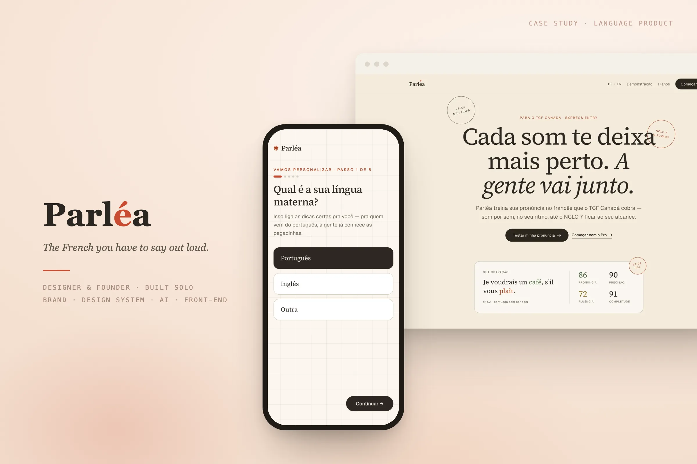
Most language apps teach you to recognize French. Parléa teaches you to be understood in it.
It has one reader in mind: someone who already speaks Portuguese, has a Canadian immigration deadline, and keeps losing points on the part of the test you cannot fake.
Info
| Project | Parléa · self-initiated |
| What it is | French pronunciation & speaking trainer for TCF Canada prep |
| For | Portuguese-speakers working toward French for Canadian immigration |
| Year | 2026 |
| Role | Designer & founder · Sole designer · Solo build |
| Scope | Brand · Design System · UX / UI · AI Speaking Surfaces · Front-end Build |
| Platform | Web · Mobile-first |
| Tools | Figma · Claude Code · Cursor · Next.js · Tailwind · TypeScript |
The challenge
Speaking is the skill people practice least, because it is the one that makes them feel worst.
Reading and listening you can do quietly, on a couch, getting most things right. Speaking is different. You hear yourself, you wince, and you stop. Yet speaking is exactly what the TCF Canada grades, and a weak Expression Orale band is what stalls a lot of immigration files.
The tools that do give pronunciation feedback are mostly tuned for English, scoring an accent the Québec exam never asks for. The friendly apps reward streaks and badges, not the specific sounds a Brazilian gets wrong in French. So the design problem was not a missing feature. It was the feeling. How do you get someone to record the same French sentence a second time, and a tenth, without flinching.
My role
Designer and founder, doing every layer myself: research, brand, the design system, the product surfaces, and the front-end build.
I wrote the positioning and the brand voice, drew the system, then carried it into a working Next.js app. The React and TypeScript came through AI-assisted coding with Claude Code and Cursor, directed by me, every diff reviewed and shipped. A single design.md holds the tokens and rules, so the design system and the code never drift apart.
Approach
Design the feeling first, because the product asks people to do something vulnerable.
Two ideas sit behind every decision. The product should be patient with you, the way a good teacher is, and it should still pull you toward a real deadline. Warm and calm, but going somewhere. That tension shaped the look before a single screen existed.
The work
1. A design system that takes the shame out
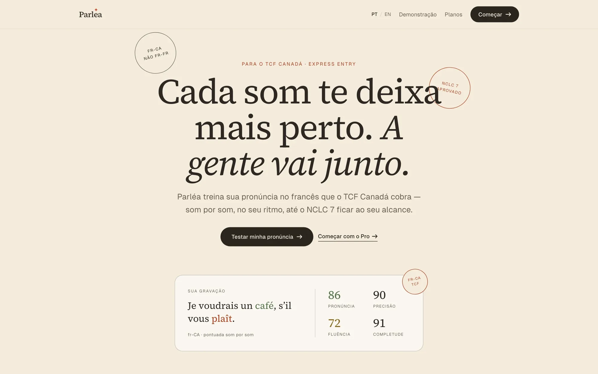
The brand has two jobs at once. It steadies you, and it keeps a goal in view. I named that the Caregiver and the Explorer, and let it decide everything underneath: serif for warmth and reading, sans for the interface, mono for the small pronunciation hints.
The accent rule is strict on purpose. Earn the coral. One deep coral, spent on a single moment per screen, usually the one button you are meant to press. Everything else stays in cream, ink, and a quiet sage. Restraint is what makes the product feel calm instead of busy.
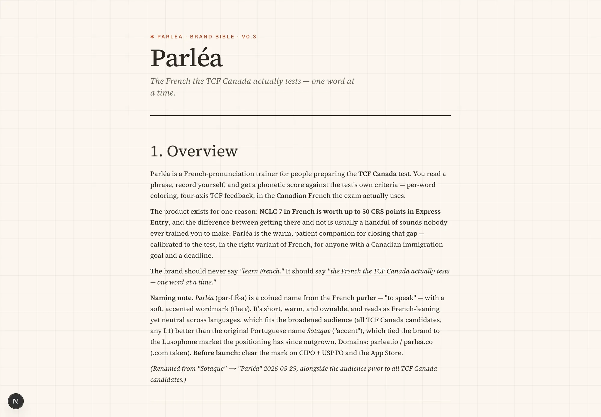
2. Onboarding that sets the tone
The first question is not a paywall or a long quiz. It asks for your mother tongue, because a Portuguese-speaker and an English-speaker trip on different French sounds, and the app can tune its hints from the start. Five short steps, plain options, generous space. The tone people will live in is set in the first ten seconds.
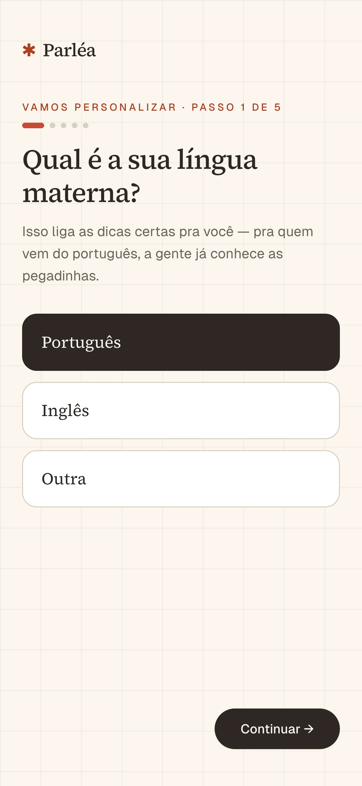
3. Read aloud, scored sound by sound
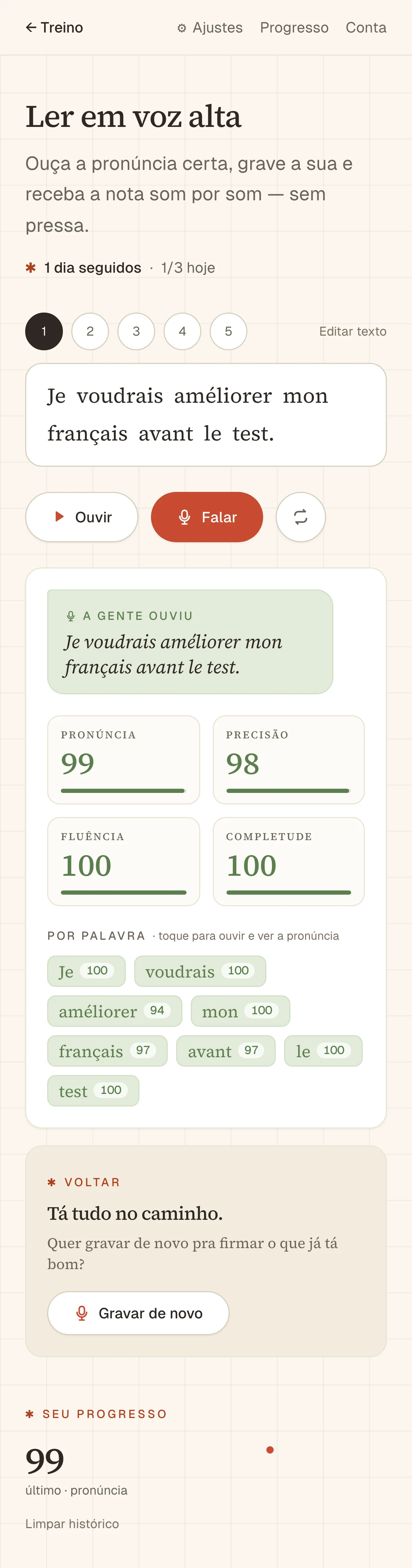
This is the heart of the product. A French phrase sits in a serif card. You listen, you record, and you get a score broken down by individual sound, not a single blunt number you can't act on. The page is almost empty by design, with one coral record button doing the inviting.
The bigger decision was the color of feedback. Green means on track. The softer red never reads as a buzzer or a failed test. It marks where you and the app go back together. Never the gotcha. A wrong sound is the start of the next rep, not a verdict.
4. A conversation partner for real situations
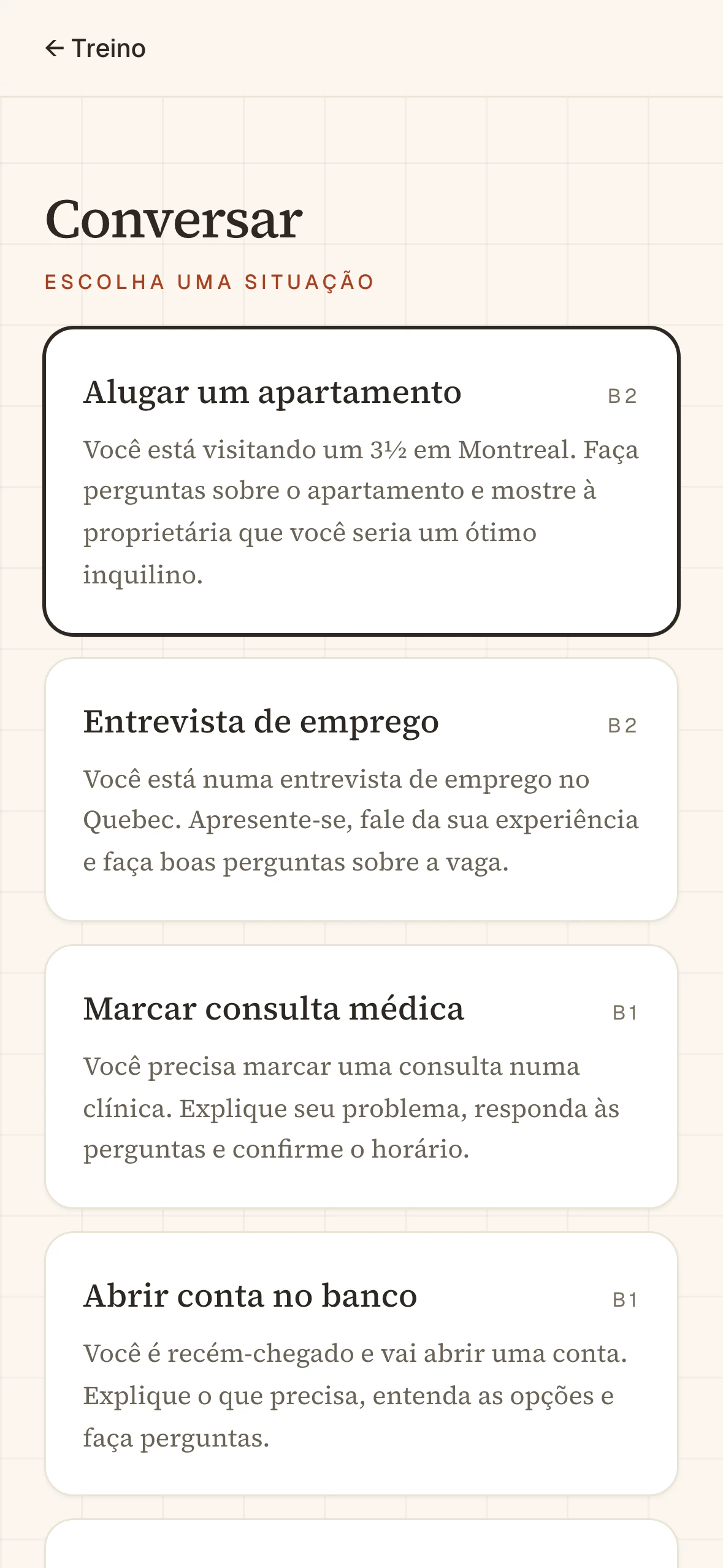
Passing the speaking exam means handling a conversation you can't rehearse. The AI partner drops you into the situations that actually matter to this audience: renting an apartment in Montréal, a Québec job interview, opening a bank account, defending an opinion. Each scenario carries its CEFR level, so the difficulty is honest, and the practice mirrors the spontaneous back-and-forth the test rewards.
5. The exam, rehearsed under the clock
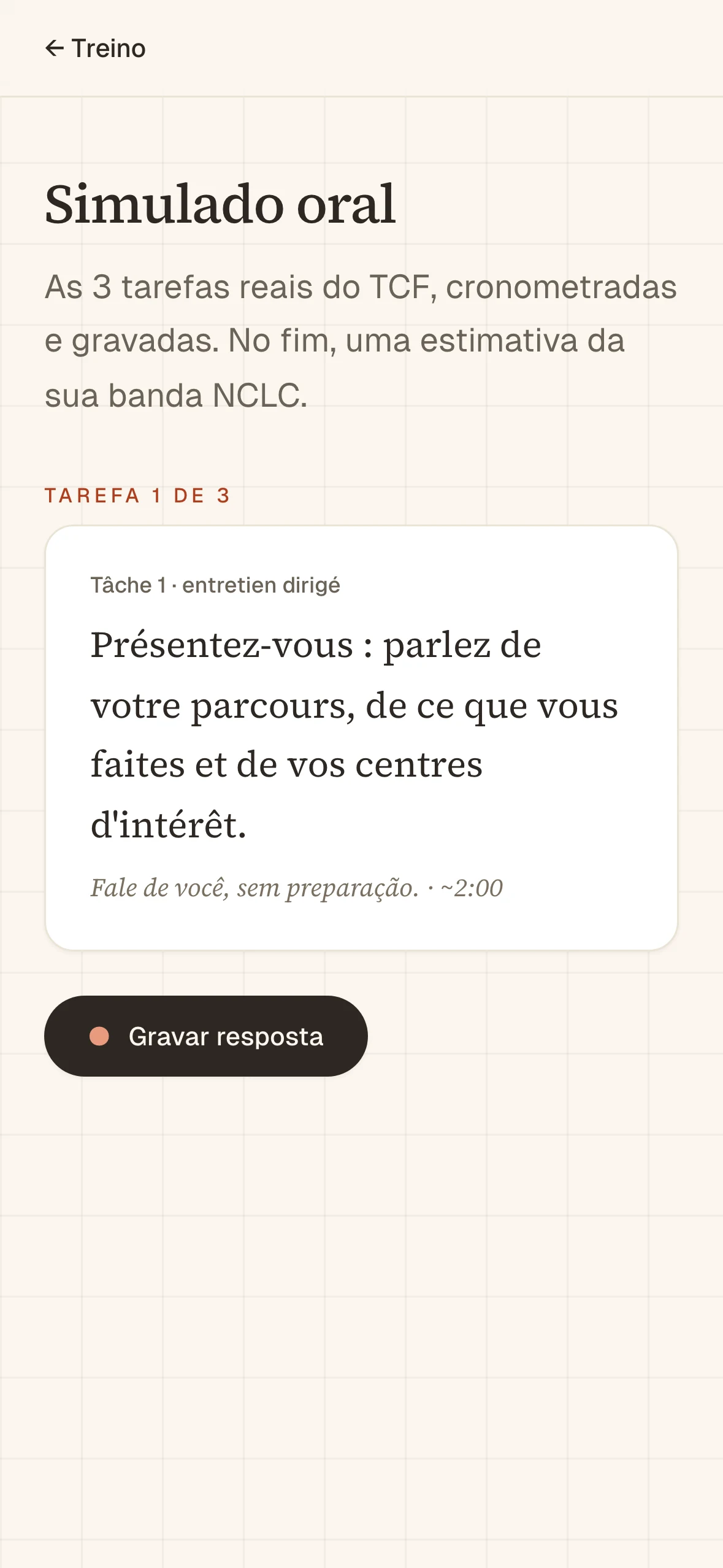
Once the sounds and the conversations feel steadier, the Simulado runs the real thing: the three TCF speaking tasks, timed and recorded, ending in an estimated NCLC band. It turns a vague fear into a number you can watch move, which is what a deadline-driven learner actually needs.
6. Built mobile-first, for stolen minutes
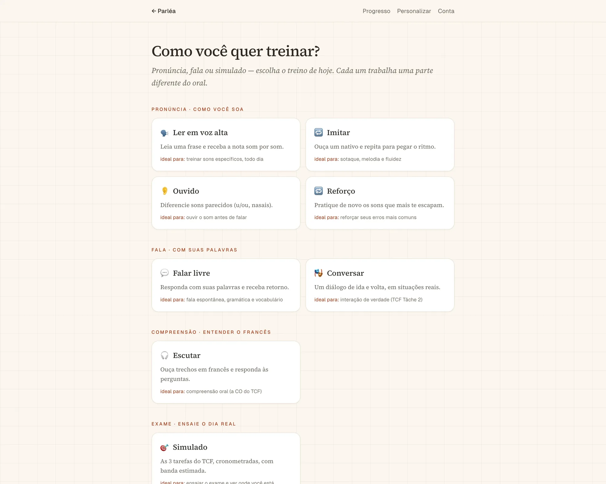
People practice in stolen minutes, on a phone, between other things. So the practice hub was drawn for the small screen first and the desktop second, never the reverse. The whole library of drills reads as one calm column on a phone and opens into a quiet grid on a laptop.
7. Design and code, the same decision
Nothing reaches the live site on trust: every pull request has to clear the same pipeline before it can merge.
- type-check
- lint
- 257 unit tests
- build
- 12 end-to-end tests
- merge — green only
The full gauntlet, run by CI on every change. A pull request that goes red stays open.
Each change lands as its own small, single-purpose pull request. The Next 14 → 16 modernization, for one, went in as four scoped PRs rather than one risky bump — small enough that every AI-authored diff stays reviewable in a single sitting.
Accessibility got the same discipline. Screen readers used to read the French phrases by Portuguese pronunciation rules; every phrase is now tagged as French, so assistive tech says the words the way the drill teaches them.
Key learning
The hardest problem wasn't the score. It was making someone willing to record themselves again.
Calm became the real feature: the empty room around the record button, the colour that coaches instead of judges, the patient voice in every label.